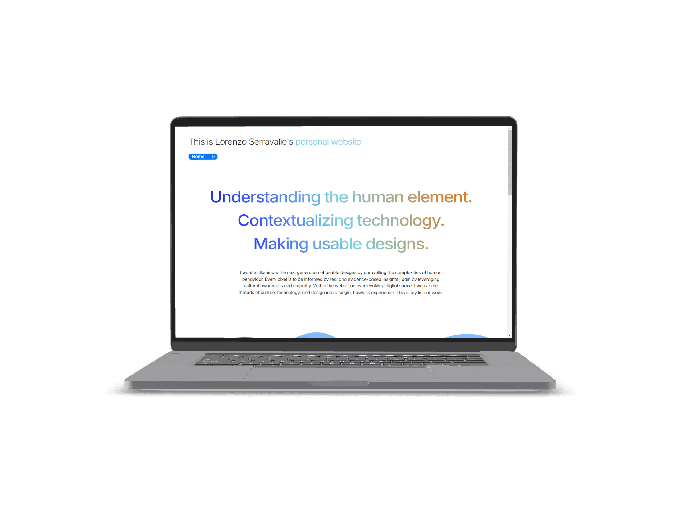

Redesigning my personal website
Or how to recognize design failures and correct them.


Executive summary:
My portfolio's traffic data revealed major issues in user engagement. I evaluated the heuristics of the previous design and discovered multiple design flaws. Completely redesigning my website led to noticeable improvements and an increase in job interviews.


Improved average duration session (ASD) by 153%.


Maintained average pageviews per session.


Reduced bounce rate by 7.75%.

Design
data analysis
web traffic data collection
sketches
mock-ups
live web design
Research
heuristic evaluation
The problem
During October 2024, I kept track of my job applications statistics. I measured an incredibly low 1.05% success rate in getting a first interview, which prompted me to look for the root cause of the problem. I looked at the three elements in my average application: resume, cover letter, and portfolio. Only the digital portfolio is a one-size-fits-all, because the others are adapted to each job posting. I decided to focus on it.
89%
bounce rate
15s
average duration session
1.6
average pages per session
This critical web traffic data from my previous portfolio's website suggested that only 1 in 10 hiring managers actually looked at my website, spending on average only 15 seconds doing so. This was a huge problem, but at least now I had benchmarks that I could measure and improve.
Evaluating the previous design
I performed a heuristic evaluation with a very efficient template by Jason Ogle using the Nielsen's ten heuristics.
Findings:
13 Observations
1 Catastrophic issue
5 Major issues
4 Minor issues
3 Cosmetic issues
8%
38%
31%
23%


1 Catastrophic issue
5 Major issues
4 Minor issues
3 Cosmetic issues
Findings:
13
Observations
8%
38%
31%
23%

Aesthetic and minimalism were the most common issues (use of blank space, alignment, verbosity), followed by obstacles in efficiency of use and navigation, like a non-fixed navigation bar that forces the user to always scroll to the top of the page.
view the old website
The redesign
I had previously used Wix, but now I felt that it was too restrictive. I decided to move to Framer, which afforded a similar design flow to Figma.



To settle on a colour scheme, I did a brief and unstructured colour study by looking at posters of sci-fi videogames and movies. I identified blue as a predominant colour and shades of orange, red, or magenta as secondaries.
I tried out different layouts and swapped components. The navigation bar, fixed to the top, was a catastrophic-level issue because it forced users to always scroll up to continue navigation. I designed a fixed component so that it always stayed in view. Since navigation bars can hide a portion of the screen, I decided to try out a collapsible bar. Notice how it passes through an in-between state to make the interaction smoother.


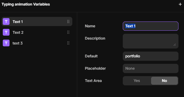
To foster traction and improve aesthetics, I designed other components such as a header typing animation. The component changed state in loop, and a text animation gave the typing effect. However, testing the component revealed that the text animation functioned only in Variant 1.
I realized that changing between component variants did not trigger the typing effect each time. To solve this, I used a 2023 feature called 'variables,' applying a variable for each component variant, resulting in this little animation:

portfolio
portfolio
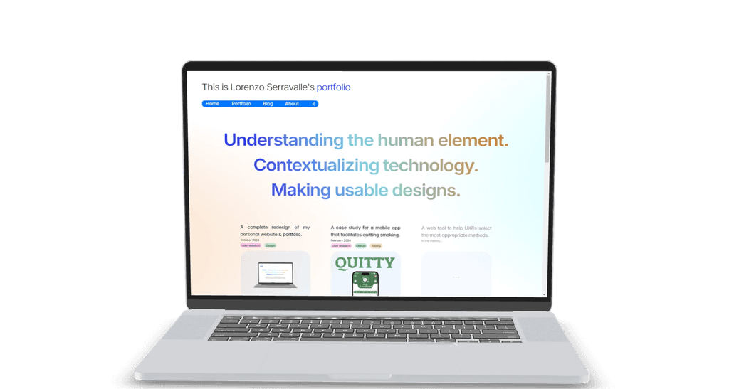
Other improvements were aimed at making navigation status clearer, allowing flexibility of use via in-page navigation menus, and improving aesthetic with better management of blank space, better alignments, hierarchy, and less verbose text.

Results


The average duration session jumped to around 38s with a 153% increase. At the same time, the bounce rate decreased by 7.75%. The average pageviews per session remained constantly fluctuating to around 1.6. This last seemingly dissonant result may be influenced by the actual content of the portfolio, which up to now is limited.
After a month, I realized that the version described on this page lacked responsiveness and structural adaptability. I used only frames/groups to structure my content and breakpoints for different screen sizes. This resulted in extreme difficulties when making the design responsive and scalable.


Returning to the original problem - increasing the success rate of my applications - I recorded that this portfolio made me achieve a 4.29% rate of interview invitations, a welcome increase from the previous 1.05% rate.
